Slide title
Write your caption hereButton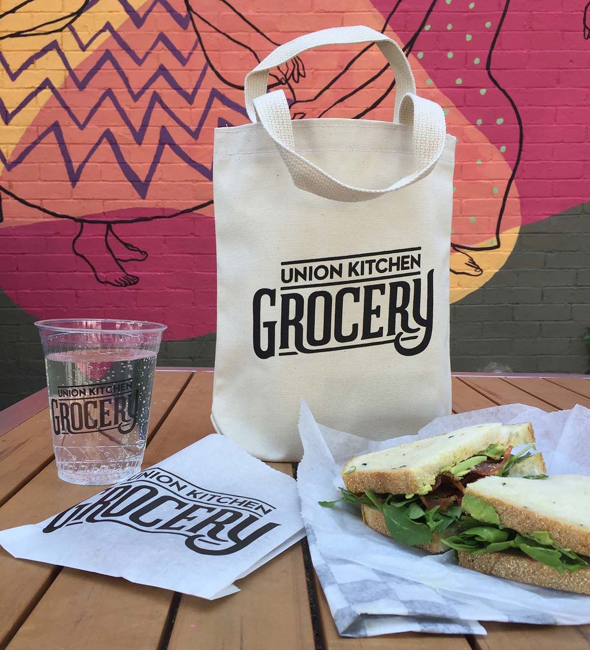
Slide title
Write your caption hereButton
Union Kitchen Grocery
Union Kitchen Grocery Transforms Local Food Scene
Goal:
The primary objective was to establish a compelling brand identity for Union Kitchen Grocery that not only enhances the existing Union Kitchen identity but also positions the grocery store as a premier destination for consumers seeking high-quality, locally sourced food products—an appealing alternative in a competitive marketplace.
Target Audience:
The focus was on attracting consumers in the Washington DC area who have a keen interest in local and specialty food items, particularly those who are likened to the discerning clientele of upscale food stores such as Dean & DeLuca, who appreciate unique culinary offerings.
Brand Elements:
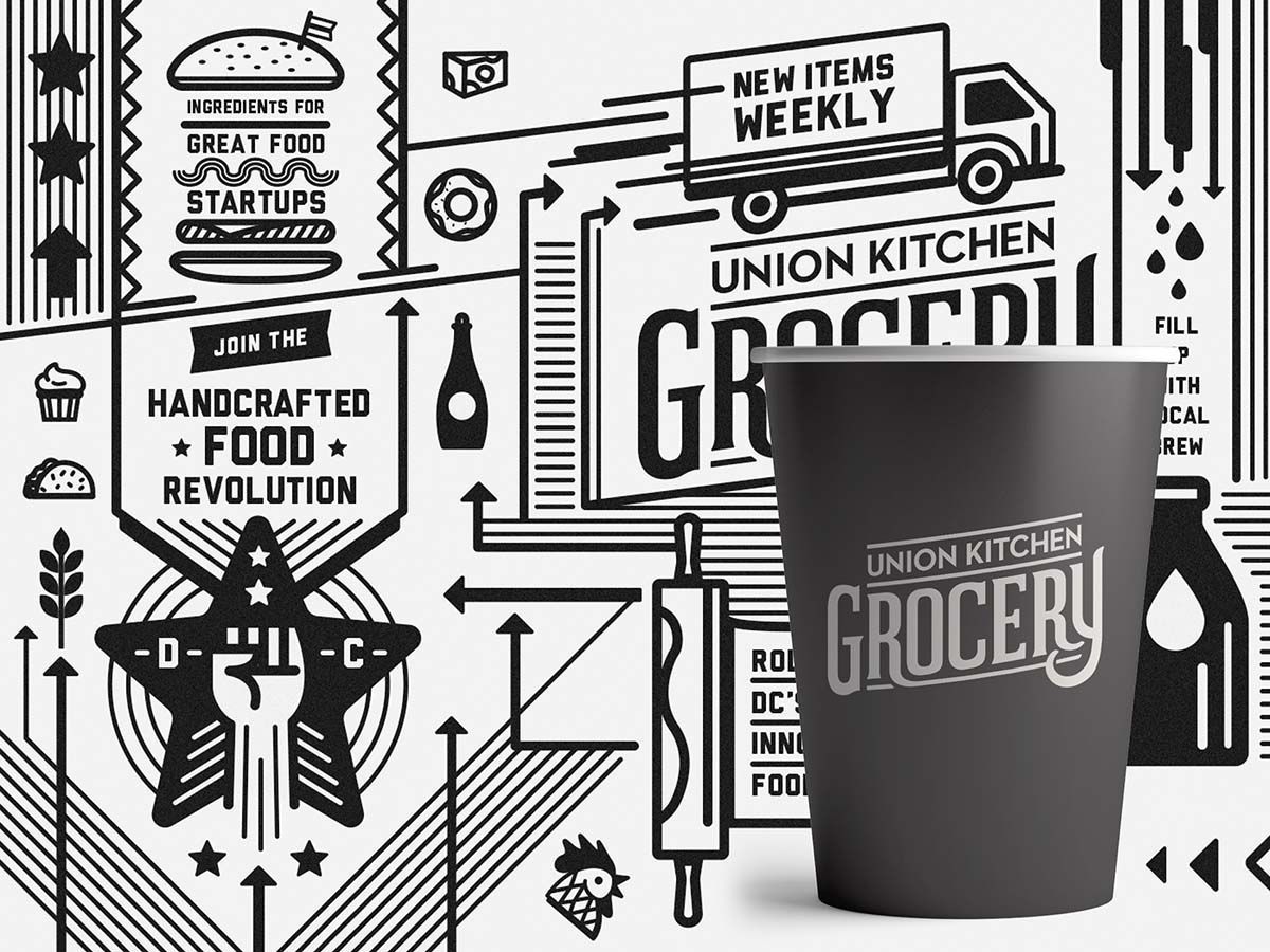
To ensure a strong brand launch, the strategy capitalized on the already established recognition of the Union Kitchen name, which resonated well within the community. A vibrant and dynamic new typeface was meticulously crafted to inject a sense of excitement and vigor, firmly establishing the grocery store as an essential stop for food enthusiasts. A classic black and white color palette was thoughtfully selected to evoke the nostalgic charm of a traditional deli or corner market, reinforcing a sense of familiarity and warmth. Iconography and typography played a vital role, skillfully employed to cultivate a market ambience that showcases various food categories while guiding customers through an enjoyable shopping experience.
Design Inspiration:
The design drew significant influence from the essence of a 1940s deli or corner market, seamlessly infused with contemporary elements that offer a modern "hipster" vibe. This unique blend allows the store to stand out while still appealing to a wide audience seeking both authenticity and innovation in their food shopping experience.
Key Success Factors:
- The brand adeptly built upon the strong foundation of the existing Union Kitchen brand, effectively leveraging its recognition and the loyalty of its customer base to foster trust and rapport.
- The design not only successfully communicated the brand's intended attributes of quality, confidence, and distinctiveness but also resonated emotionally with customers, fostering a sense of community.

